Customizing the Home Page
You can control the visibility of elements that appear on the Home Page. The changes that you make can be viewed simultaneously while making these changes.
To customize the home page:
-
In the Navigation Menu, browse to Publishing >Themes.
-
On the Themes page, navigate to the Custom Themes section and click the Edit button next to the theme you want to customize.
-
In the Themes workspace, navigate to Pages > Home > Layout and Sections and click the Expand button.
-
To configure the left, right, or both side panels, expand Side Panel and enable the Show Side Panels setting.
-
Under the Panel Options section, you can select from the available panels and then click the Add
 button to add elements to the selected panels: Left Panel, Right Panel, or Both Panels.
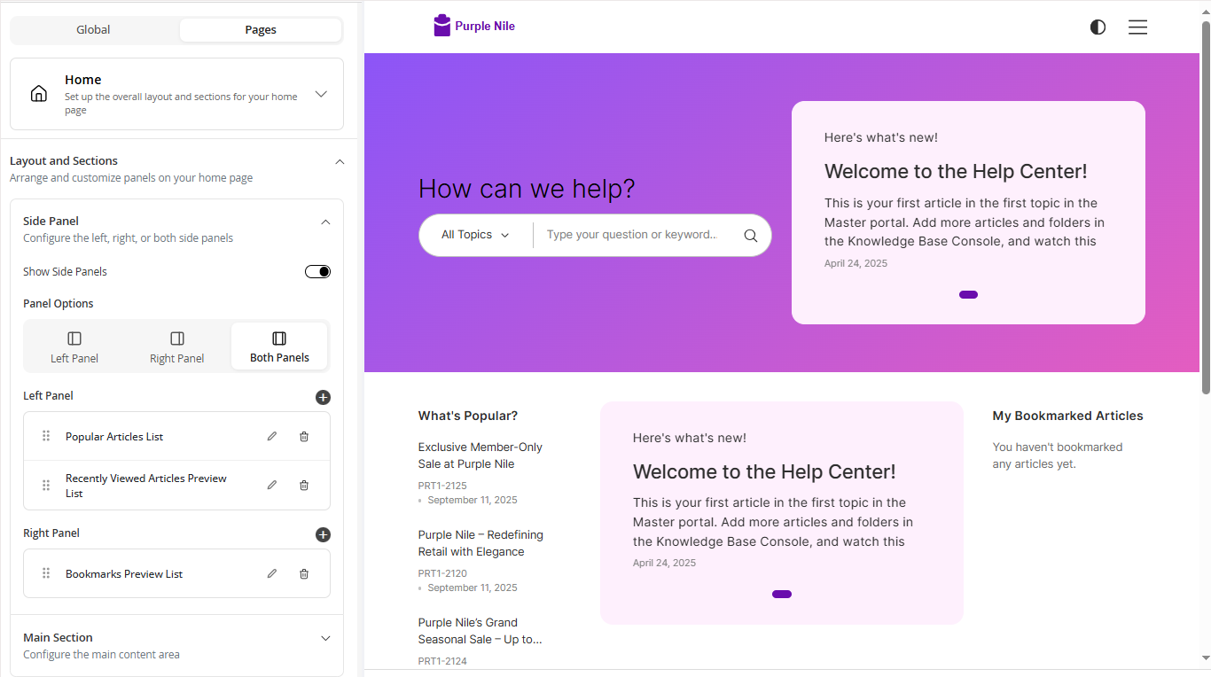
-
To configure the main content area of the home page, expand the Main Section and perform the following actions:
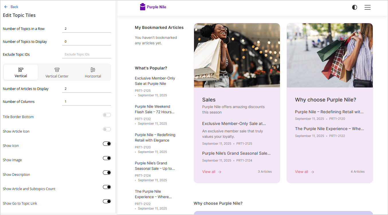
- Edit the Topic Tiles: Click the Toggle button to display the topic tiles and then click the Edit button to configure the following settings:
- Number of Topics in a Row: Provide the number of topics you want to display in a row.
- Number of Topics to Display: Provide the number of subtopics you want to display.
- Exclude Topic IDs: Provide the Topic ID for the topic you do not wish to display on the home page.
- Select a topic tile layout from the available layouts: Vertical, Vertical Center, or Horizontal.
- Number of Articles to Display: Provide the number of article titles that you want to display in the Topic Tile. This setting is only available for the Vertical layout.
- Number of Columns: Provide the number of columns in which the articles are displayed. This setting is displayed only when you provide a number greater than 0 for the Number of Articles to Display setting.
- Title Border Bottom: Click the Toggle button to display the border under the Topic title.
- Show Article Icon. Click the Toggle button to display the article icon next to the article titles.
- Show Icon: Click the Toggle button to display the Topic icon
- Show Image: Click the Toggle button to display the topic image.
- Show Description: Click the Toggle button to display the description for the Topic
- Show Article and Subtopics Count: Click the Toggle button to display the total number of articles and subtopics in a topic.
- Show Go to Topic Link: Click the Toggle button to display the View More link.
- Show Shadow: Click the Toggle button to add a shadow to the topic tile.
- Show Title: Click the Toggle button to display the topic title.
- Show Card View: Click the Toggle to enable the card view for the topic tiles.
- Make image fit in the card: Select this option to ensure the topic image fits the topic tile card.
- Background Color: Click the color tool and select a background color for the topic tile.
- Text Color: Click the color tool and select a text color for the topic tile.
- Show Meta Info: Click the Toggle button to display the metadata for the articles. Summary is visible by default if you enable this setting. You can also add a field by clicking the Add Field button. You can also rearrange the sequence in which the information is displayed and you can delete any metadata by clicking the Delete button. This setting is only available for the Vertical layout.
- Click the Apply button to save and view your changes in the portal preview.
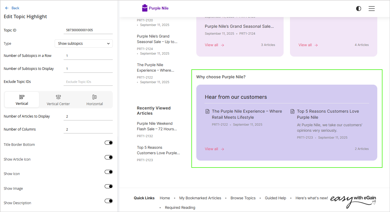
- Add Topic Highlight: Click the Add Topic Highlight button and provide the following details to highlight a specific topic in your main container:
- Topic ID: Enter the Topic ID for the topic that you wish to highlight.
- Type: From the dropdown select either the Show articles or Show subtopics option.
- Number of Articles to Display: Enter the number of articles that you want to display in the topic highlight.
- Number of Columns: Enter the number of columns in which the articles are displayed.
- Background Color: Click the color tool and select a background color for the topic tile.
The settings mentioned below are only displayed when Type is set as Show subtopics.
- Number of Subtopics in a Row: Provide the number of subtopics you want to display in a row.
- Number of Subtopics to Display: Provide the number of subtopics you want to display.
- Exclude Topic IDs: Provide the Topic ID for the topic you do not wish to display on the home page.
- Select a topic tile layout from the available layouts: Vertical, Vertical Center, or Horizontal.
- Number of Articles to Display: Provide the number of article titles that you want to display in the Topic Tile. This setting is only available for the Vertical layout.
- Number of Columns: Provide the number of columns in which the articles are displayed. This setting is displayed only when you provide a number greater than 0 for the Number of Articles to Display setting.
- Title Border Bottom: Click the Toggle button to display the border under the Topic title.
- Show Article Icon. Click the Toggle button to display the article icon next to the article titles.
- Show Icon: Click the Toggle button to display the Topic icon
- Show Image: Click the Toggle button to display the topic image.
- Show Description: Click the Toggle button to display the description for the Topic
- Show Article and Subtopics Count: Click the Toggle button to display the total number of articles and subtopics in a topic.
- Show Go to Topic Link: Click the Toggle button to display the View More link.
- Show Shadow: Click the Toggle button to add a shadow to the topic tile.
- Show Title: Click the Toggle button to display the topic title.
- Background Color: Click the color tool and select a background color for the topic tile.
- Show Meta Info: Click the Toggle button to display the metadata for the articles. Summary is visible by default if you enable this setting. You can also add a field by clicking the Add Field button. You can also rearrange the sequence in which the information is displayed and you can delete any metadata by clicking the Delete button. This setting is only available for the Vertical layout.
- Click the Apply button to save and view your changes in the portal preview.
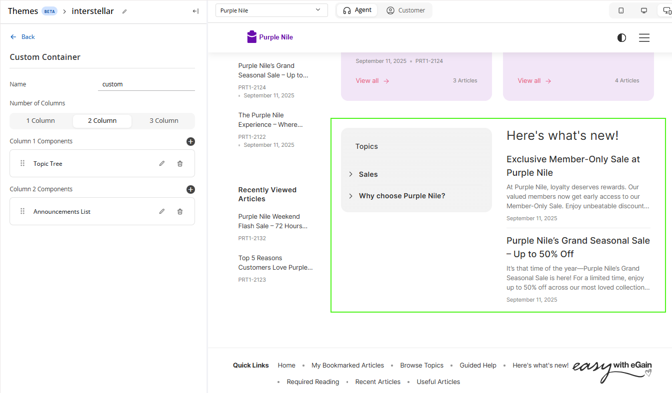
- Add container: Click the Add Container button to customize your main content area. Perform the following tasks in the Custom Container section:
- Name: Provide a name for your custom container.
- Number of columns: Select the number of columns from the available options: 1 Column, 2 Columns, or 3 Columns.
- For each column, select the components by clicking the Add button next to the column component field and selecting the components from the list.
- You can edit the selected components further by clicking the Edit
 button. For more details, see Container Components.
- Click the Apply button to save and view your changes in the portal preview.
- Edit the Topic Tiles: Click the Toggle button to display the topic tiles and then click the Edit button to configure the following settings:
-
Click Save to retain all the changes to your theme.
Container Components
You can add and edit the properties for the following components to your custom container:
Topic Tree Configurations:
When you add a Topic Tree to your container column, you can configure the following properties:
-
Number of Levels: Specifies how many nested levels are displayed within the topic tree.
-
Number of Topics in Each Level: Specifies how many topics are displayed at each level.
-
Show Topic Heading: Enables the display of the “Topic” title for the topic tree.
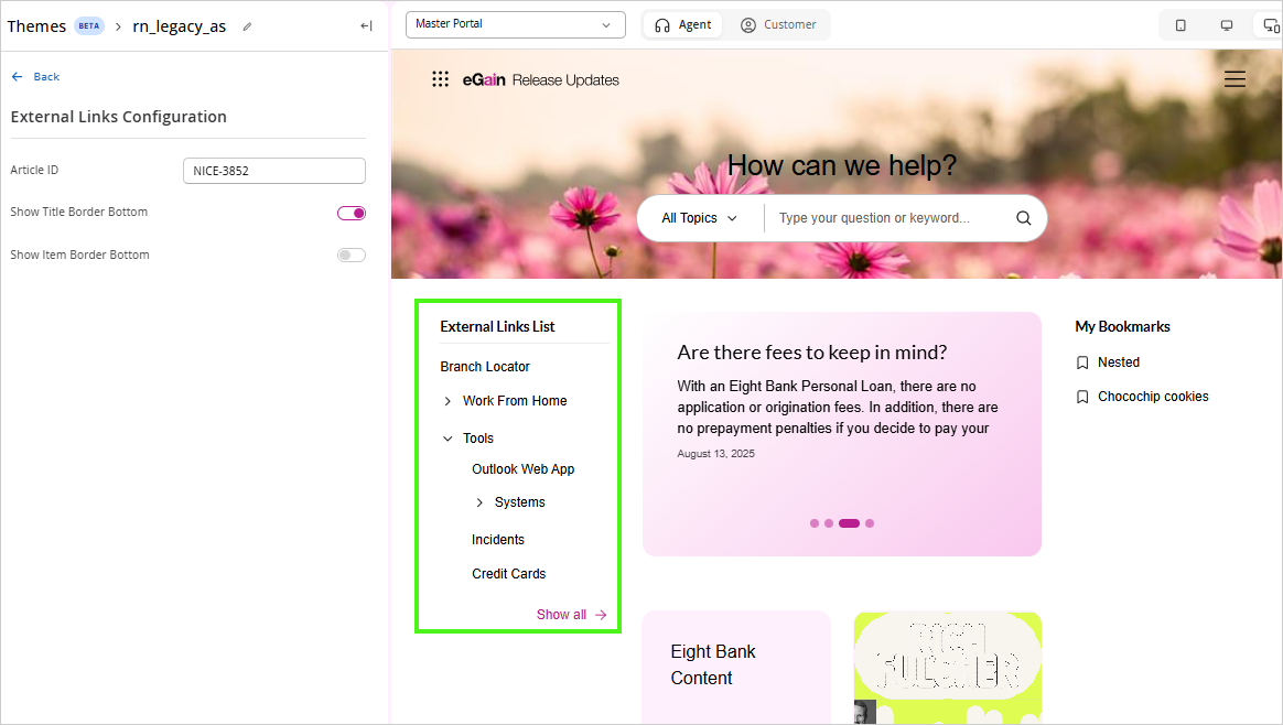
External Links Configurations:
-
Article ID: Provide the article ID.
-
Show Title Border Bottom: Displays a border below the section title.
-
Show Item Border Bottom: Displays a border underneath each item in the list.
Displaying External Links in the Portal
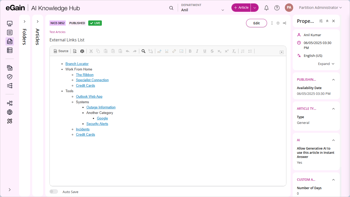
To display external links in the External Links List section of the portal, create an article (using any article type) that contains the external links formatted as a bulleted list.
- Each top-level bullet represents a main link or category displayed in the portal.
- Sub-bullets under a main bullet appear as nested links within that category in the portal.
- You can organize links hierarchically by adding additional bullet levels in the article.
-
After creating the article, use its Article ID when configuring the external links source. The portal reads the bullet structure from the article and renders it as the external links list.
-
Clicking Show all in the portal opens the article itself, allowing users to view the complete list of links.
Useful Items from Folder List Configurations:
-
Number of Articles to Display: Select the number of articles you want to display.
-
Folder ID to Display Articles: Provide the ID of the folder containing the useful articles list. These lists can be created form the Quick Access Lists section. For more information, see Creating Quick Access Lists.
-
Show Card View: Define whether the useful articles appear in a card layout.
-
Number of Columns: Number of columns in which you want to display the articles.
-
Show Meta Information: Enabling this option, provides you with an option to select which metadata information you want to display. You can add additional metadata fields, rearrange the sequence in which they appear and also delete the ones you do not want to display.
Announcements List, Newly Created Items, & Recently Updated Items List Configurations:
-
Number of Articles to Display: Select the number of articles you want to display.
-
Show Border Bottom: Displays a border underneath the section title.
-
Enabling this option, provides you with an option to select which metadata information you want to display. You can add additional metadata fields, rearrange the sequence in which they appear and also delete the ones you do not want to display.
-
Show Item Border Bottom: Displays a border underneath each item in the list.
-
Show Card View: Define whether the useful articles appear in a card layout. This option is available only for the Newly Created Items & Recently Updated Items Lists.
Announcements Carousel Configurations:
-
Number of Articles to Display: Select the number of articles you want to display.
-
Animation Interval (seconds): The interval after which the next article is displayed in the announcement carousel.
-
Show Last Modified Date: Enable to display the last modified date for the articles.
-
Show Article Description: Enable to display the article description instead of the article content.
-
Show Card View: Define whether the Announcement Carousel is displayed using a card layout.
-
Announcements Size: From the dropdown, select the size of the announcement: Small, Medium, or Large.
-
Show Announcements Label: Enable to Display the "Announcements" label.
-
Show Article Image in Announcement block: Define how the article image is displayed in the carousel: None, Side or Background.
-
Background Style: To style the background of the welcome banner, you can choose one of the following options:
-
Solid Color: Provide the background Color.
-
Gradient: Provide the Start Color, and End Color.
-
Image: Drag and drop the image, click Browse, or provide the Image URL.
-
Text Color: Select the color of the carousel text.
-
Recently Viewed Articles Preview List
-
Number of Articles to Display: Select the number of articles you want to display.
-
Show Card View: Define whether the Recently Viewed Article list is displayed using a card layout.
-
Show Border Bottom: Displays a border underneath the section title.
-
Number of Columns: Number of columns in which you want to display the articles
-
Enabling this option, provides you with an option to select which metadata information you want to display. You can add additional metadata fields, rearrange the sequence in which they appear and also delete the ones you do not want to display.