Configuring the Theme Colors
You can change the branding and text colors for the dark and light mode of your theme. The color selections you make apply to all pages on the portals and can be viewed simultaneously while making changes in the theme workspace.
To configure colors for the theme:
-
In the Navigation Menu, browse to Publishing >Themes.
-
On the Themes page, navigate to the Custom Themes section and click the Edit button next to the theme you want to customize.
-
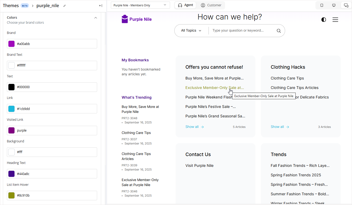
In the Themes workspace, navigate to the Global > Branding & Identity > Colors and click the Expand button.
-
From the expanded menu, you can make the following color changes:
For each element, you can choose the color used in both light and dark themes. To do this, click the color picker and switch between tabs using the light mode
 and dark mode
  icons. After selection, the corresponding hex codes for both modes are displayed for each element.
-
Brand: Select a color for primary buttons, badges, and certain other elements like accordion backgrounds if certain style is selected.
-
Brand Text: Select a text color that contrasts with the brand color used for backgrounds such as badges and buttons.
-
Text: Change the text color used for the body and heading elements.
-
Link: Change the text color applied to links on hover.
-
Visited Link: Select a text color for the visited links.
- Heading Text: Change the color used for main headings, which apply to page heading elements such as page names, article names on article pages, and list titles.
- List Items Hover: Change the color applied to list items on hover.
-
-
Click the Save button to retain the changes you made to the theme.