About the Charts Gadget
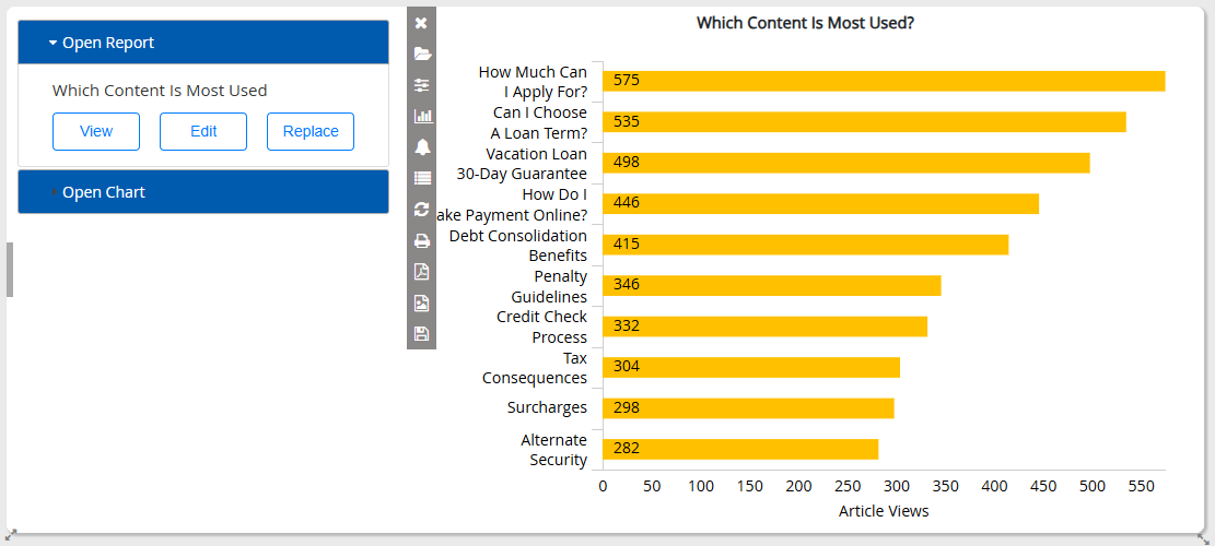
The Charts Gadget is the most useful gadget for dashboards. It allows users to select a previously saved report and visualize some aspect of that report in a variety of chart formats.
Users can:
-
View a report in one of several chart styles, including pie charts, donut charts, bar charts, line charts, and heatmap charts.
-
Save the chart configuration with the report to view the report in that format again.
-
Print the chart or export it as a JPG or PDF.
-
Show or hide the last updated timestamp on real-time charts
Working with the Charts Gadget
Initially the Charts Gadget opens as a split pane. The menu pane to the left enables you to choose the report you want to build your chart from. From there, you can either select an existing chart saved previously for that report or select various options to create a new chart. The pane on the right initially shows the report as a grid so that you can preview the data and then shows the chart as you build it. Once the chart is built, click the ‘handle’ in the left edge of the gadget to minimize the menu pane or to expand it again.

The gadget has a function bar contains the following options:
-
Minimize
 button and Maximize
  button: Minimize or maximize the function bar
 -
Chart Selection
 button: Toggle the menu pane to show report and chart selection.
 -
Parameter Options
 button: Toggle the menu pane to show or set report parameters.
 -
Chart Configuration
 button: Toggle the menu pane to show or set charting options.
 -
Thresholds
 button: Toggle the menu pane to show or set report thresholds. Threshold values are visualized on certain chart types:
-
Bar, line and area charts show a dotted line for each threshold value so that you easily see if a metric falls above or below the line. The color of the dotted line corresponds to the font color specified for the threshold.
-
In gauge charts, the gauge bar appears dark green by default. However, if the metric matches a threshold value then the gauge bar changes color to match the font color specified for the threshold. For example, you can use this to make gauges appear in a brighter and more attention-grabbing color when they have exceeded a particular value.
-
If the parameters or thresholds of the selected report from the chart gadget have been previously saved, these changes are saved on the report itself and take effect wherever the report or any of its other charts is viewed.
-
Charts Legend
 button: View the chart legend and, optionally, double-click on any legend color to change it.
 -
Refresh Chart
 button: Refresh chart data.
 -
Pause Chart
 button: Pause chart. This applies to real-time charts only, prevents the chart from refreshing as long as it is paused.
 -
Set Refresh Date
 button: Set refresh rate. This applies to real-time charts only.
Real-time data has a minimum refresh rate which is unaffected by the chart’s refresh rate (e.g. 60 seconds for chat and email real time reports). If the chart refresh rate is more frequent than that of the data being shown, then the chart sometimes refreshes to show the same data.
-
Print
 button: Print the chart.
 -
Download PDF
 button: Download PDF of chart.
 -
Download Image
 button: Download image file of chart. This is not available when showing a grid report.
 -
Save Chart
 button: Save chart.
Related Information